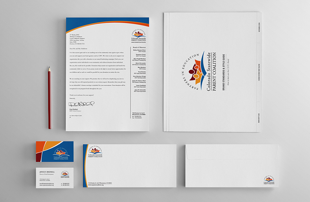
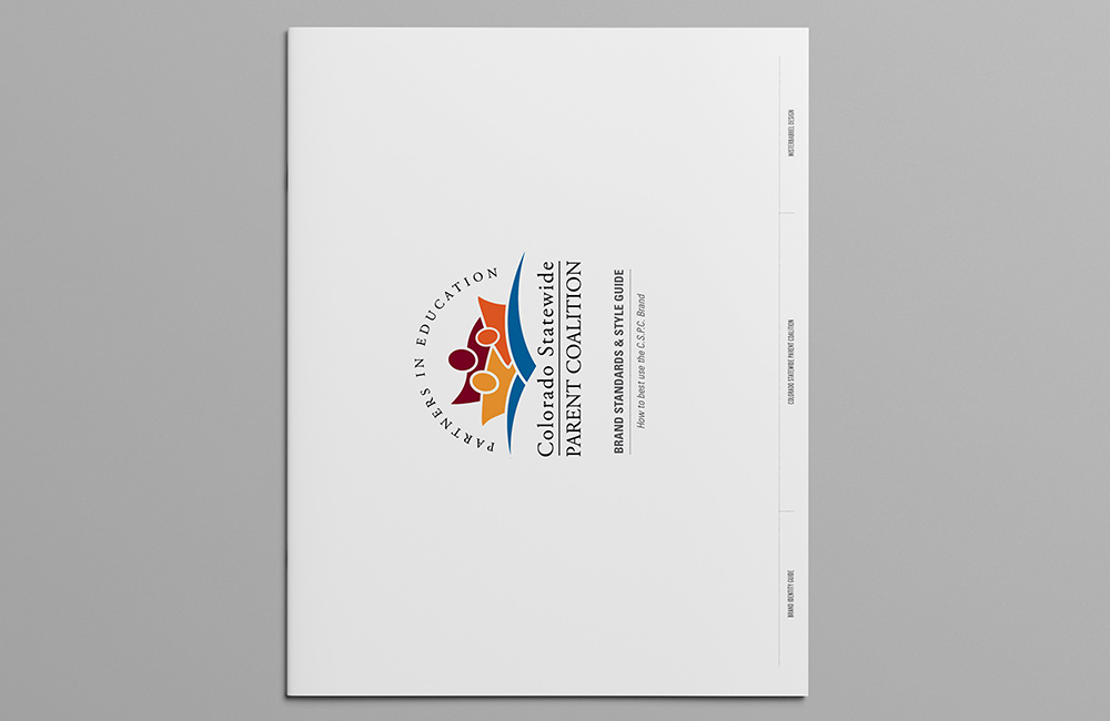
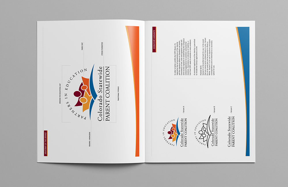
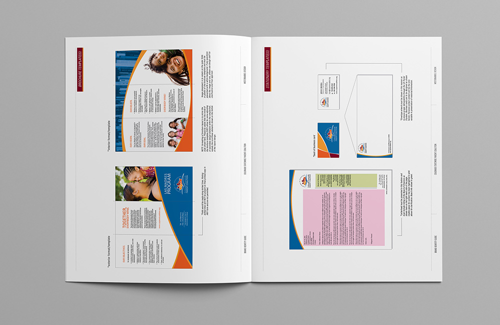
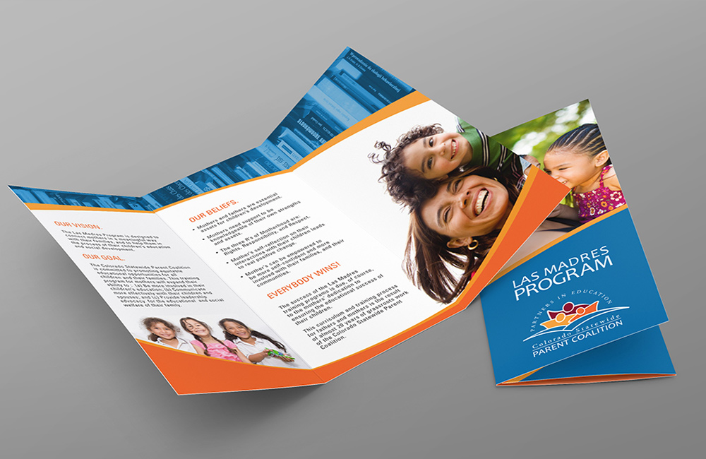
The agency works at bringing the family element into the learning processes, and as such I wanted to present the graphic elements in a color palette that was vibrant and indicative of a thriving family unit. The overall identity system employs a common thread of moment that is implied through arching bands of color that echo the curvilinear forms of the logo and a consistent color story is told from start to finish in the overall brand development.